
A sleep chart can make a complicated night look exact. You see a narrow strip of Deep sleep, a larger block of Core, and several interruptions. It is tempting to treat those colored minutes as a report card.
A better first question is: what did the watch estimate, and how complete is the recording? That tells you how much weight to give the chart before you start explaining it.
Updated October 8, 2026: device instructions and sources checked; the data example was analyzed for this revision.
What Core, Deep, and REM mean
Apple maps its labels to conventional sleep stages as follows:
| Apple Health label | Corresponding stage | How to read the label |
|---|---|---|
| Core | Non-REM stages N1 and N2 | Sleep, rather than a failed attempt to reach Deep |
| Deep | Non-REM stage N3 | An estimate of slow-wave sleep |
| REM | Rapid eye movement sleep | A separate sleep stage |
| Awake | Wakefulness | Time classified as awake within the recording |
The watch does not measure brain waves. Apple's 2023 sleep-staging paper describes an accelerometer-based model that classifies 30-second windows using movement signals, including subtle motion related to breathing. Core combines two stages; Apple chose that name partly to avoid implying that “light” sleep is unimportant.
That distinction matters when you export the data. The result is a series of classified time intervals, not a direct recording of your brain passing through each stage. See the Sleep Analysis data reference for the stored categories.
How accurate are Apple Watch sleep stages?
Accuracy has more than one meaning. Detecting that someone is asleep is an easier question than choosing the correct sleep stage throughout the night. A headline percentage about sleep detection cannot establish the accuracy of every Deep or REM interval.
Apple's validation paper reports that its most common stage error was assigning true Deep sleep to Core. That gives a concrete reason to avoid interpreting a short Deep segment as a precise physiological deficit. The paper describes a specific validated algorithm; it does not establish that every future software version performs identically. Apple's validation results
An independent 2025 study compared six wearables, including Apple Watch Series 8, with polysomnography during a laboratory night. Across the devices, identifying sleep was more successful than identifying wakefulness, and agreement on multiple sleep states remained imperfect. Participants wore two to four devices, so the full study's 62 participants were not necessarily all in each device comparison. These results concern the tested hardware, software, and study population. Schyvens and colleagues, Sleep Advances
My practical interpretation is to use the chart to frame questions: “Was this recording much shorter than my others?” or “Have my sleep times become more irregular?” A single stage percentage is a weak foundation for deciding what your body needs.
Read the whole night before the percentages
Open Health → Browse → Sleep and inspect the daily chart, then switch to a longer view. Apple's sleep interface offers stage details and sleep-duration views. For missing recordings, its current instructions emphasize enabling Track Sleep with Apple Watch, wearing the watch overnight, keeping it charged, and ensuring a comfortable fit. Apple's sleep guide
Use this order when reviewing a night:
- Check coverage. Does the recording begin and end where you would expect? A watch charged midway through the night gives a partial view.
- Check duration. Read the minutes asleep before comparing the shares assigned to each stage.
- Check the denominator. Is a percentage calculated from time asleep, the whole recording, or time in bed?
- Add your own context. Record whether you remember being awake, removed the watch, or traveled. Keep observations separate from explanations.
For example, 60 minutes is 20% of five hours but only 12.5% of eight hours. A lower percentage does not necessarily mean fewer minutes. That arithmetic alone can make two seemingly contradictory charts agree.
Why an export can contain more sleep than the night had
HealthKit distinguishes in bed, asleep without a specified stage, and the individual sleep stages. In-bed intervals can overlap sleep intervals; several apps can also contribute records. Apple's sleep category documentation defines the categories used by those records.
Imagine an illustrative export with one eight-hour in-bed interval and seven hours of stage intervals inside it. Summing every row yields 15 hours. Nothing about the night was 15 hours long: the calculation added two descriptions of overlapping time.
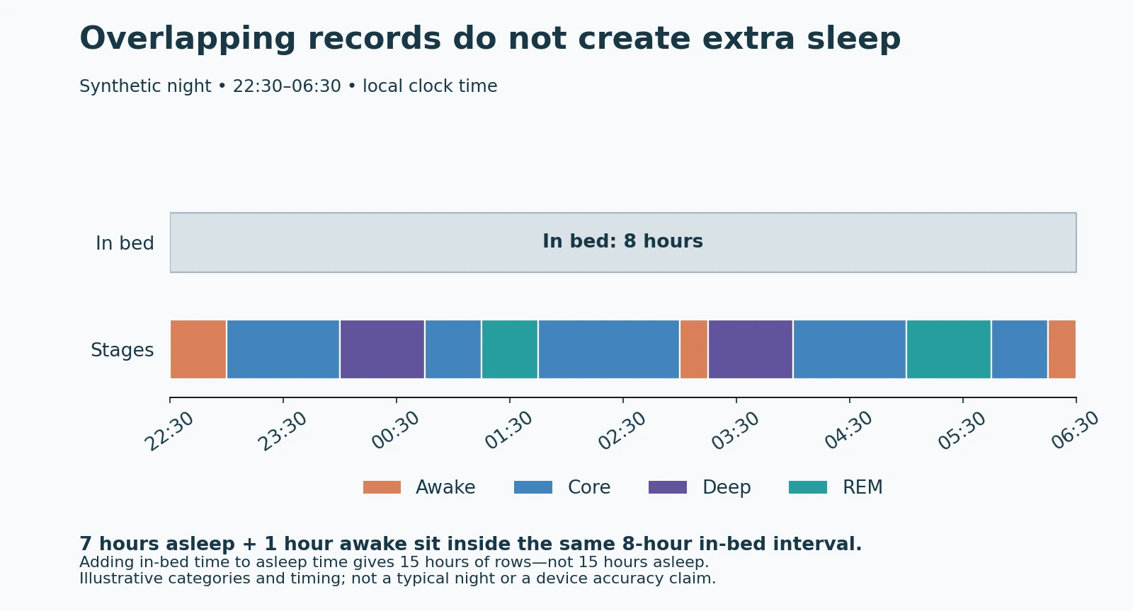
An unspecified asleep interval needs similar care. It does not mean Core. Reclassifying every unspecified row as Core manufactures a stage that the source never supplied.
For analysis, I would first select one source, inspect overlapping intervals, and preserve the category labels. If two asleep intervals overlap, count their shared time once when calculating total sleep. If their stage labels conflict, flag the conflict rather than silently assigning a winner. Source reconciliation is also central to understanding mismatched step counts, although sleep requires interval logic rather than a step-total calculation.
What my own sleep export actually contained
For this revision, I inspected my synced sleep records with a read-only database query. The selection included intervals starting from September 1, 2026 at midnight through, but not including, October 1 at midnight in America/Los_Angeles time.
That returned 886 intervals: 404 Core, 205 Awake, 160 REM, and 117 Deep. Those are record counts. A long interval and a short one each contribute one row, so the bars cannot tell you the proportion of the month spent in each stage.
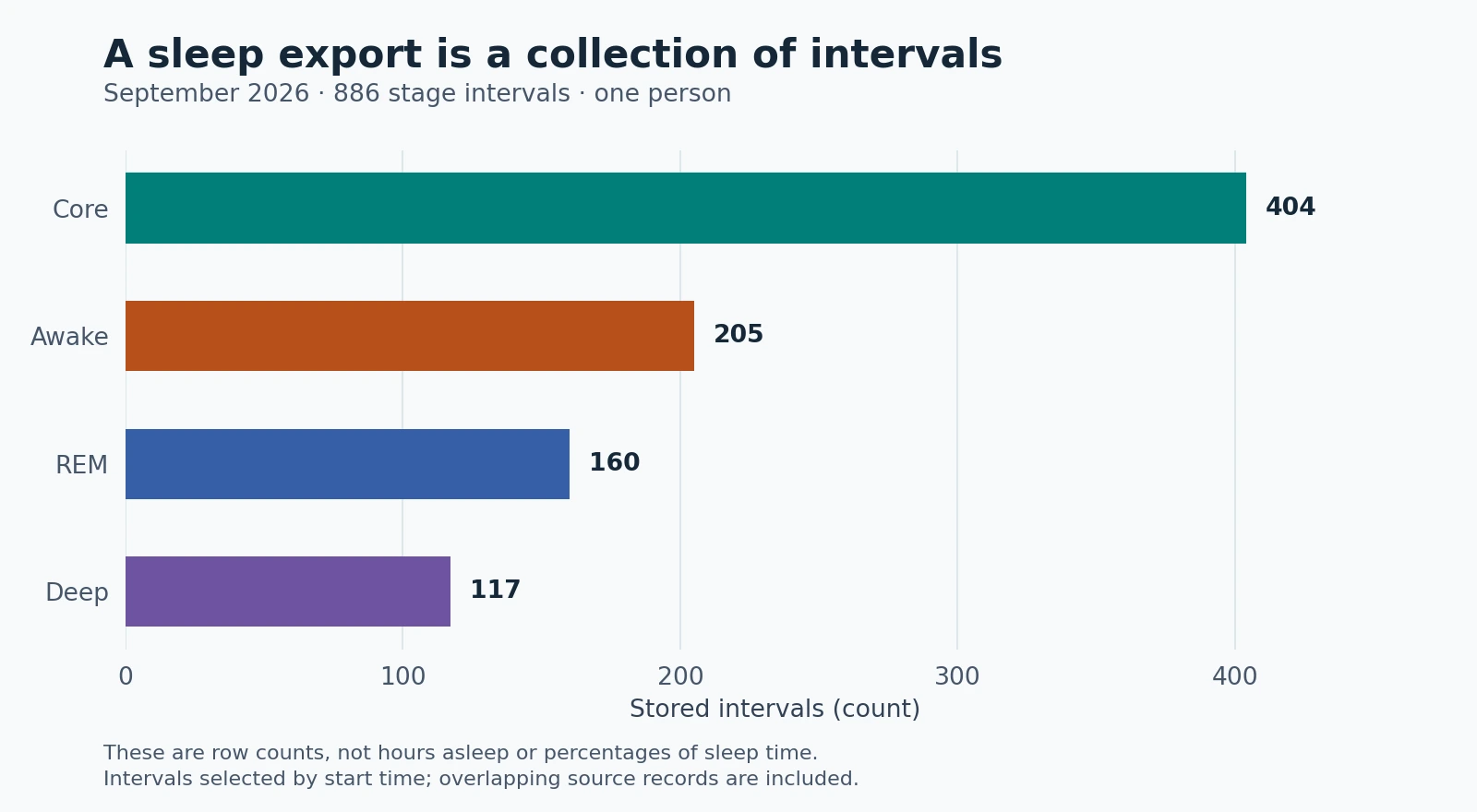
The records included three source revisions and overlapping intervals. A source revision is not necessarily a separate device. Those findings are why this figure stops at counts: a trustworthy nightly duration needs source and overlap handling first. My archive illustrates a data-model issue; it does not establish normal sleep patterns or validate the watch against a sleep study.
Build a useful view of several weeks
A small analysis table can tell you more than a dramatic dashboard:
| Field | Why keep it |
|---|---|
| Sleep-session date | Keeps one overnight session together |
| Selected source | Makes device or app changes visible |
| Recorded asleep minutes | The union of the selected asleep intervals |
| Core, Deep, REM, unspecified minutes | Preserves what the source actually reported |
| Coverage or conflict note | Stops an incomplete record looking complete |
| Personal note | Separates your recollection from a device estimate |
Choose an explicit rule for assigning sessions to dates. Using the date you woke up is understandable, but it is an analysis choice, not something to infer by grouping every interval's start timestamp. A session crossing midnight otherwise becomes two apparently short nights. Use local time and document how naps or multiple sessions are handled.
When summarizing a week, show how many nights contributed. “Average across four recorded nights” is more honest than presenting it as a complete seven-night average. Leave unrecorded nights missing. Entering zero would claim you did not sleep.
If you compare sleep with Apple Watch HRV, retain those same coverage checks for both series. Two charts moving together can suggest a question worth examining. They do not isolate a cause.
What to do with a worrying chart
Start by checking the record rather than chasing a target percentage. Save a few representative nights, note what you experienced, and look for repeated issues in recording or timing.
A stage chart cannot settle whether you have a sleep disorder. Clinical sleep studies collect additional signals and are used to investigate sleep-related problems; a clinician determines which testing is appropriate. If sleep problems are persistent or affect daily life, bring the history and your observations to that conversation. NHLBI's explanation of sleep studies
The useful outcome is a history you can explain: which nights were recorded, how their duration and timing compare, and where uncertainty remains. The colored stages add detail to that history. They should not obscure it.